


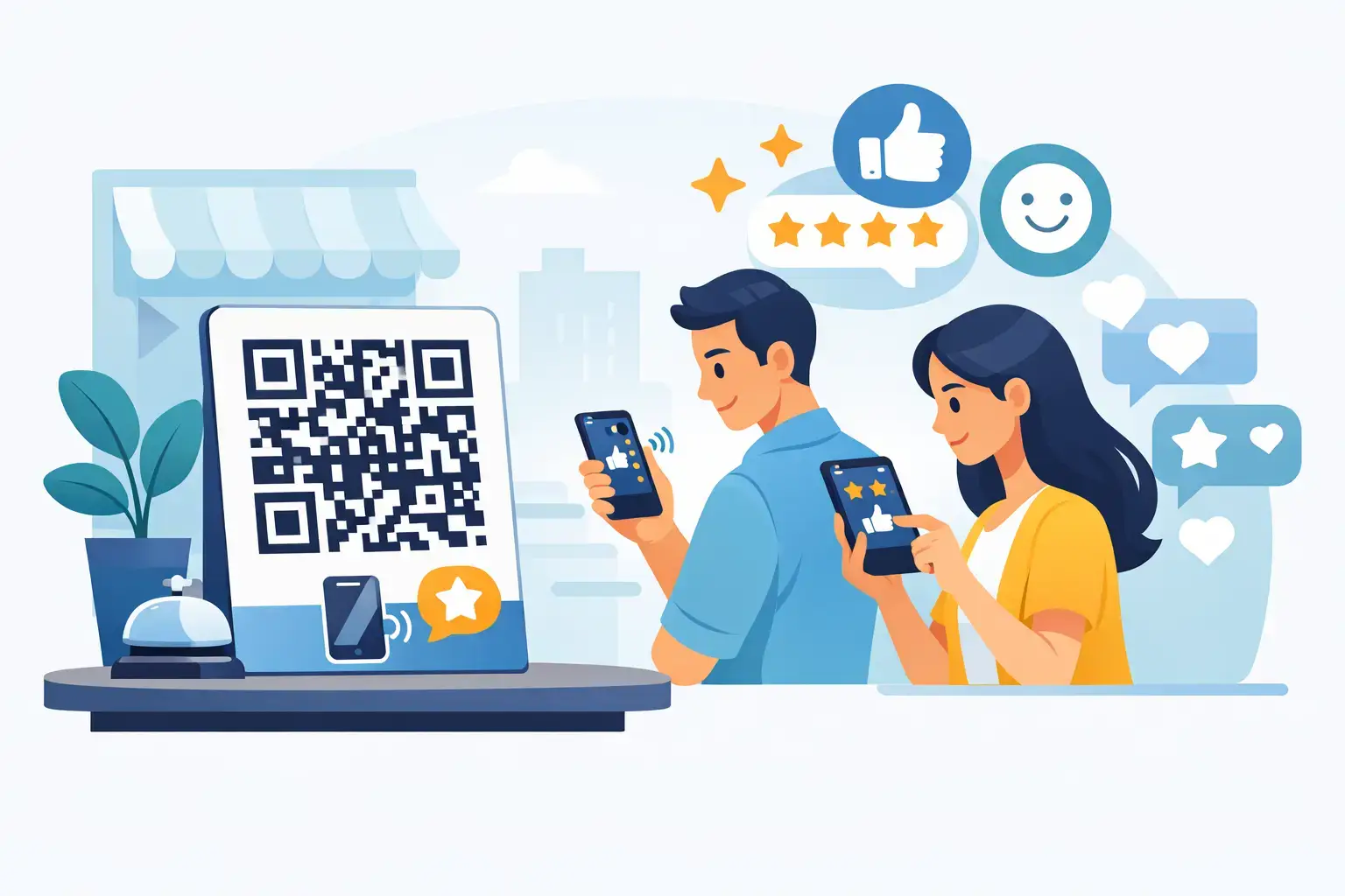
A great customer experience has a short window of opportunity. The meal has just ended, the appointment went smoothly, the purchase is in hand, or the service technician has solved the problem. QR signage puts a simple next step in that moment: scan the code, choose a destination, and leave a review or connect with your business.
For customer-facing businesses, that convenience matters. Most customers are happy to support a business they enjoyed, but few will remember to search for your Google Business Profile later. A well-designed QR display turns good feedback into a quick action while the experience is still fresh.


What QR Signage Does for Your Business
QR signage is a physical sign, display, sticker, card, or tabletop piece featuring a scannable QR code. When a customer scans it with their phone camera, they are sent directly to a chosen digital destination. That may be your Google Reviews page, TripAdvisor profile, Booking.com listing, Trustpilot page, social channel, WhatsApp conversation, menu, booking form, or a custom URL.
The best signage removes unnecessary steps. Instead of asking a customer to open a browser, search for your business, find the correct listing, and then leave feedback, you give them a direct path. That is a meaningful difference when someone is standing at a counter, waiting for a receipt, or heading out the door.
For local businesses, more consistent review collection can support several commercial goals. Strong recent reviews build trust before a new customer calls or visits. They help your business stand out in local search results. They also reveal what customers value, from attentive staff and clean facilities to fast service and reliable results.
A QR code alone is not a strategy, though. Placement, design, timing, and the destination behind the scan determine whether a sign becomes a reliable source of engagement or simply fades into the background.
Where QR Signage Performs Best
The right location is where a customer has completed a meaningful part of their experience and has a few seconds to act. A restaurant may see the best response at the table or beside the payment terminal. A dental office may do better with a polished display at checkout after a successful visit. A retail store can place a small sign near the register, inside packaging, or by the exit.
Consider the natural touchpoints in your operation:
- Tabletops, bill folders, and host stands for restaurants, bars, and cafés
- Reception desks and checkout counters for clinics, salons, hotels, and service businesses
- Product packaging, thank-you cards, and bags for retail stores and ecommerce orders
- Doors, waiting areas, and exit points where visitors have time to scan
- Service completion points, such as vehicle pickup desks, treatment rooms, or job-site handoffs
One location is rarely enough for a busy business. Customers move through different parts of the experience, and not every touchpoint feels equally natural. A hotel guest may scan a plaque at reception, while a restaurant guest may respond more readily to an elegant table tent. The goal is visibility without clutter.
Premium physical presentation also changes how the request feels. A clean acrylic stand, branded plaque, or customized tabletop display looks intentional and professional. A wrinkled paper sign taped to a wall can still work, but it may not reflect the level of care your business wants customers to associate with its brand.
Make the Request Clear and Easy
Customers should understand what happens after they scan. Vague signs that say only “Scan Me” create hesitation. A simple, direct message is more effective: “Loved your visit? Leave us a Google review.” For a hotel, you might ask guests to “Share your stay on TripAdvisor.” For a salon, “Tell us about your new look” feels more personal and relevant.
Keep the wording short. The sign does not need to explain your entire reputation strategy. It needs to answer three questions quickly: what should I do, where will I go, and why does it matter?
A useful call to action connects the scan to the customer’s experience. “Your feedback helps us serve you better” is appropriate in healthcare and professional services. “Enjoyed your meal? Your review helps local diners find us” can work well for restaurants. If you are directing customers to Instagram or WhatsApp, say so clearly rather than making them guess.
The visual hierarchy matters too. Your QR code should be large enough to scan comfortably from the expected distance, with clear contrast around it. Avoid placing it over a busy image or surrounding it with too much text. Include your logo, brand colors, and a recognizable platform icon when appropriate, but let the code and call to action remain the focal points.
Choose the Right Destination for Each Moment
Google Reviews is often the highest-priority destination for local businesses because it influences search visibility and buying confidence. However, it is not the only useful destination. A restaurant in a tourist-heavy area may prioritize TripAdvisor. A hotel may want feedback on Booking.com. A beauty business with highly visual work may use signage to grow Instagram engagement, while a service company may use WhatsApp to start a fast conversation with a prospective customer.
The destination should match the business goal and the customer context. If your immediate priority is building social proof, send happy customers to your review platform. If your team needs to answer questions before a customer leaves, route the scan to a messaging channel. If you are promoting a seasonal offer or loyalty program, a custom landing page may be the better choice.
This is where flexible QR signage has an advantage. Your physical display can stay in place while the digital link behind it changes as your campaign, platform priorities, or business needs change. That helps protect the value of a premium branded display rather than making it disposable after one promotion.
ReviewsLink products can also combine QR scanning with NFC technology, giving compatible phones the option to tap instead of scan. For customers, both routes lead to the same simple result: less effort between a positive experience and meaningful online engagement.
Train Staff Without Making It Awkward
Even beautiful signage benefits from a light human prompt. Staff should not pressure customers for positive feedback or interrupt a busy moment. They can simply make customers aware that the option is there.
The most effective language is natural and timely. At checkout, a team member might say, “If you have a moment, there’s a code here to share your experience.” After resolving a service issue, a manager can say, “We’d appreciate your feedback when you’re ready.” That is enough. The sign does the rest.
Avoid scripts that sound demanding, and never ask only for five-star reviews. Requesting honest feedback is more credible, more customer-friendly, and better for building a reputation that reflects the real business. If a customer raises a concern in person, listen and resolve it before directing them to a public review channel.
Measure What Is Working
QR signage should earn its place in your customer journey. Review volume is one obvious measure, but look beyond the total number. Watch for trends in review recency, rating patterns, mentions of staff or service, and changes after you introduce signage at a specific location.
You can also test practical variables. Compare a counter display with a table tent. Try one call to action for a month and another the next month. Use different destinations for different departments if that reflects how customers interact with your business. A medical practice, for example, may use a reception display for Google Reviews and a separate sign for patient resources or appointment requests.
The trade-off is consistency versus complexity. Multiple codes and destinations can help you learn more, but too many signs can confuse customers and dilute the request. Start with one clear goal per location, then expand only when each display has a defined purpose.
Build QR Signage Into the Experience
The strongest QR signage does not feel like an extra marketing task. It feels like a thoughtful part of the customer experience: a polished display at the right moment, a clear invitation, and a direct route to the platform that matters most.
When customers can leave a review with a simple scan or tap, your team spends less time asking and more time delivering the service worth talking about. Put the invitation where satisfaction is highest, keep it elegant, and give every positive interaction somewhere useful to go.